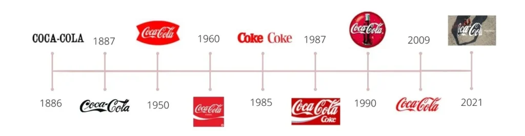
Coca-Cola’s logo is iconic for being universally recognizable. In 1886, Dr. John S. Pemberton nailed the formula, but it was his bookkeeper the one on came up with the name “Coca-Cola” and, it was also him the one that designed the Coca-Cola script logo.
The stronger your brand identity is, the more recognizable it’ll be and the more successful
you’ll be in creating memory structures with your target market. Having a disciplined strategy for building your brand allows your identity to evolve through time. And that’s something Coca-Cola knows well how to do it.
But, along these 130 years, Coca-Cola’s logo has been changing:
Coca-Cola’s logo is an icon of modern culture. A study conducted by the marketing agency MBLM, surveyed 3,000 consumers in the U.S. to see how they connect with different companies and Coca-Cola ranked No. 1 in the beverage category.

But the famous logo, that we all know has been released this year with a new style. The new logo features the traditional Coca-Cola logo but is slightly wrapped around. The company says it was “inspired by iconic Coca-Cola packages wrapped with our signature trademark.” The new logo, called “Hug” also comes with a new tagline “Real Magic”.

According to an article on the company website, the intentions with this new campaign are to “increase the Coca-Cola consumer base through an ecosystem of experiences anchored in consumption occasions, such as meals and breaks, and merged with consumer passion points like music and gaming.”